Display Settings & Export
Display Options
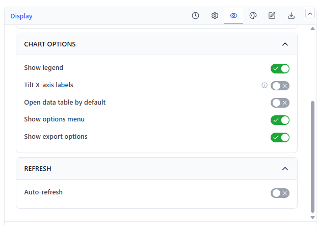
| Setting | What It Does | Default |
|---|---|---|
| Show legend | Legend for the dots and every enabled reference line | On |
| Tilt X-axis labels | Angles date labels so long ranges do not overlap | Off |
| Open data tab first | View mode opens on the table instead of the chart | Off |
| Show options menu | The in-view menu for refresh and export | On |
| Show export options | Whether viewers can export at all | On |
| Auto-refresh | Re-fetches on an interval: 5, 10, 15, or 30 minutes | Off (15 min) |
Colors
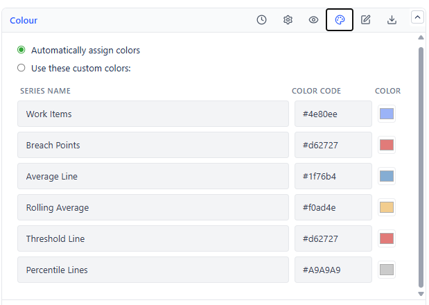
Auto uses the app palette. Custom exposes one color per element:
| Element | Default |
|---|---|
| Work item dots | Blue |
| Breach dots (above threshold) | Red |
| Average line | Dark blue |
| Rolling average line | Amber |
| Threshold line | Red |
| Percentile lines | Grey |
Data Table View
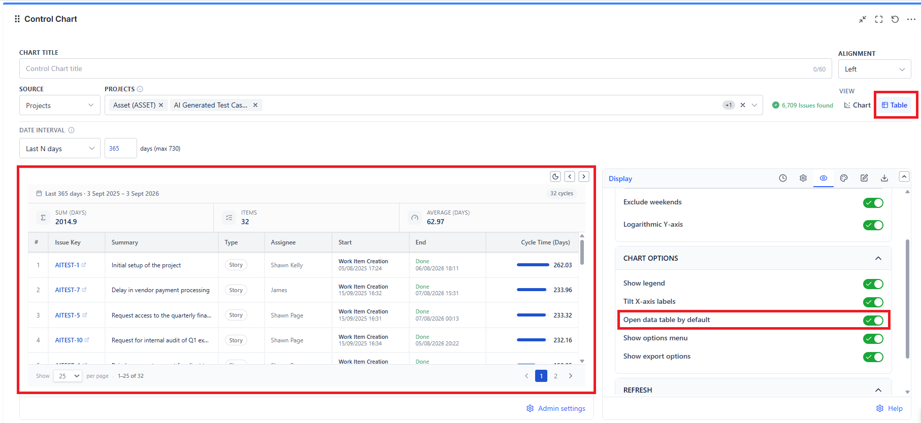
The table lists every plotted cycle with its work item key, summary, cycle start, cycle end, and duration in your chosen unit. Use it to identify the specific items behind an outlier dot, and to hand a list to whoever needs to follow up.
Export
| Format | Contains |
|---|---|
| PNG | The chart exactly as displayed, including reference lines |
| CSV | Every plotted record with dates and durations, for spreadsheet analysis |
Common Use Cases
Forecasting with confidence. Read the 85th percentile and use it as your commitment number. If it says 12 days, an item started today is very likely done inside 12 days.
Detecting process drift. Enable the rolling average. A line drifting upward over a quarter means work is getting slower - usually growing item size, growing WIP, or growing review queues.
Retrospective evidence. Set the threshold at your SLA and look at the breach dots for the sprint. Each one is a concrete conversation, not an opinion.
Comparing before and after. Pin a custom date range around a process change and compare the average and spread against the same-length window before it.