Overview
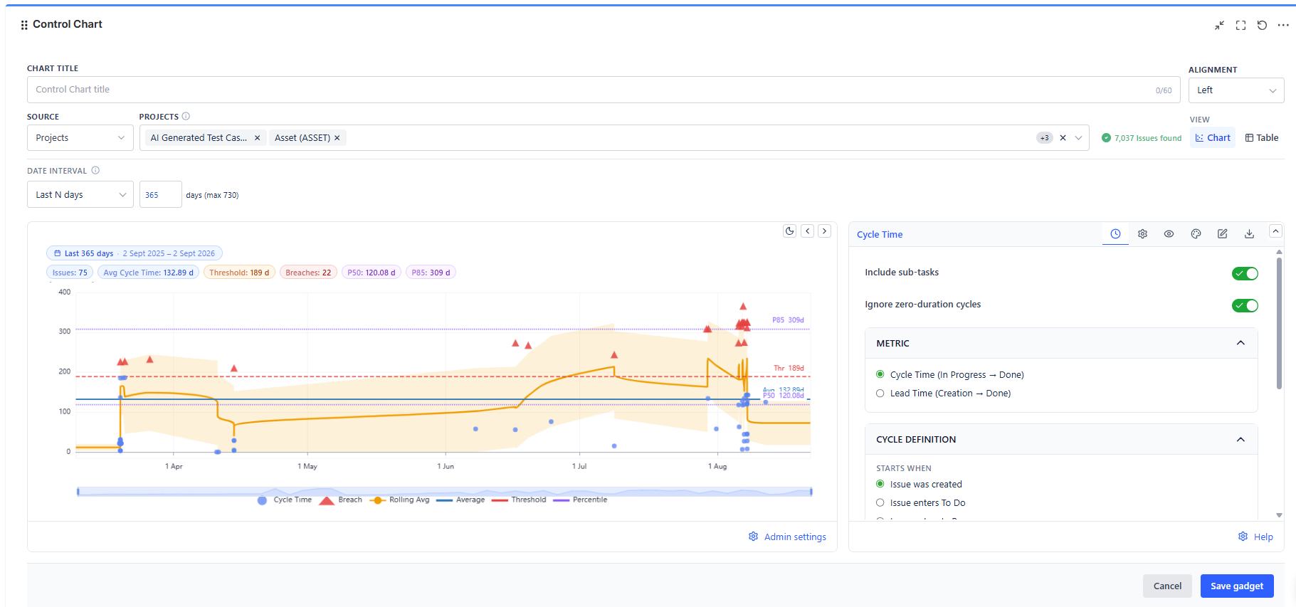
The Control Chart answers two questions at once: how long does work take, and how consistent is that number. The X-axis is the date each item finished its cycle; the Y-axis is how long that cycle took. A tight horizontal band means a predictable process. A widening spread means your delivery estimates are getting less reliable.
Overview
| Feature | Description |
|---|---|
| Scatter Plot | One dot per completed work item - X-axis = completion date, Y-axis = cycle duration |
| Two Metrics | Cycle Time (start status to end status) or Lead Time (creation to end status) |
| Configurable Cycle | Define exactly which workflow transitions start and end the measurement |
| Five Overlay Types | Average, rolling average, standard deviation band, threshold, and up to 5 percentile lines |
| Data Table View | Switch to a table listing every item with its start date, end date, and duration |
| Log Scale | Compress a wide duration range so short cycles stay readable next to outliers |
How to Read the Chart
- Each dot = one work item that completed its cycle
- X position = the date the cycle ended
- Y position = how long the cycle took, in your chosen unit
- Dots above the threshold line = items that breached your SLA
- A tight horizontal band = predictable delivery
- A widening spread over time = growing unpredictability - investigate before committing to dates
- Dots above the 85th percentile line = the slow tail; these are what stakeholders remember
Action pattern: Quote the 85th percentile, not the average, when someone asks "how long will this take?" The average is met roughly half the time; the 85th percentile is met most of the time.
Data Sources
| Source Type | When to Use |
|---|---|
| Projects | Measure delivery speed across one or more Jira projects |
| Board | Scope to a board's own filter - the board's JQL is resolved automatically |
| Saved Filter | Reuse a filter your team already maintains |
| Custom JQL | Write a precise query (for example, one issue type or one component) |
| Dynamic Filter Controller | Connect to a shared filter bar so the chart re-scopes with the rest of the dashboard |
Date Interval
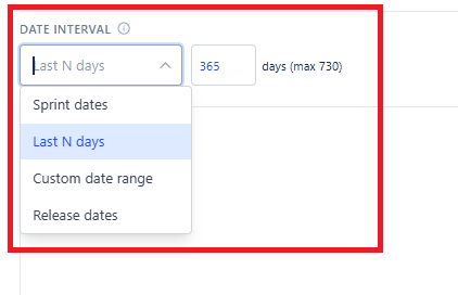
The interval controls which completed items appear, independent of the data source.
| Interval Type | What It Covers |
|---|---|
| Last N days (default, 90) | A rolling window that moves forward on its own - no editing needed |
| Custom date range | A fixed start and end date |
| Sprint dates | Pick any board and sprint; its start and end dates become the window. Enable auto-latest to always follow the active sprint |
| Release dates | Pick any project and release; its start and release dates become the window |
Sprint and Release intervals are available for every data source type - the board or project you pick there supplies dates only, not the issue scope.