Reference Lines & Scale
Reference lines turn a cloud of dots into a decision aid. Each overlay is a pure recalculation over the data already loaded - toggling one never re-queries Jira.
Available Overlays
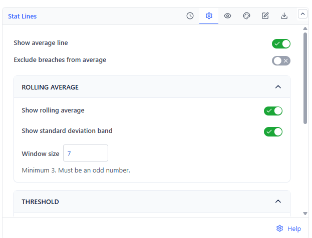
| Overlay | What It Draws | Default |
|---|---|---|
| Average line | The mean cycle duration across all plotted items | On |
| Rolling average | A moving average over a window of N items - shows whether you are trending faster or slower | Off (window 7) |
| Standard deviation band | A shaded band around the average showing normal variation | On |
| Threshold line | A fixed value you set - your SLA or target | Off (value 14) |
| Percentile lines | Up to 5 lines at percentiles between 1 and 99 | On (50th and 85th) |
Configuring Percentiles
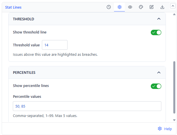
Enter percentile values as a list. Up to five are allowed, each between 1 and 99.
| Percentile | Reads As | Typical Use |
|---|---|---|
| 50th (median) | Half of all items finished this fast | The typical case |
| 85th | 85% of items finished this fast | The number to quote in commitments |
| 95th | 95% of items finished this fast | Worst-case planning, escalation triggers |
Threshold and the Average
Exclude breaches from the average removes items above the threshold line before the average is calculated. Turn it on when a handful of abandoned or forgotten items distorts an otherwise healthy average. Leave it off when you want the average to reflect reality including outliers.
Rolling Average Window
The window is a count of work items, not days. A window of 7 means each point averages that item and the six before it. Smaller windows react faster and look noisier; larger windows are smoother and slower to show a change.
Log Scale
Turn on logarithmic scale when your durations span orders of magnitude - a few items at 200 days flatten everything below 10 days into a single line at the bottom. A log scale keeps both readable, at the cost of making the visual distances non-linear.