Histogram Chart
Reference Lines & Display
Reference Lines
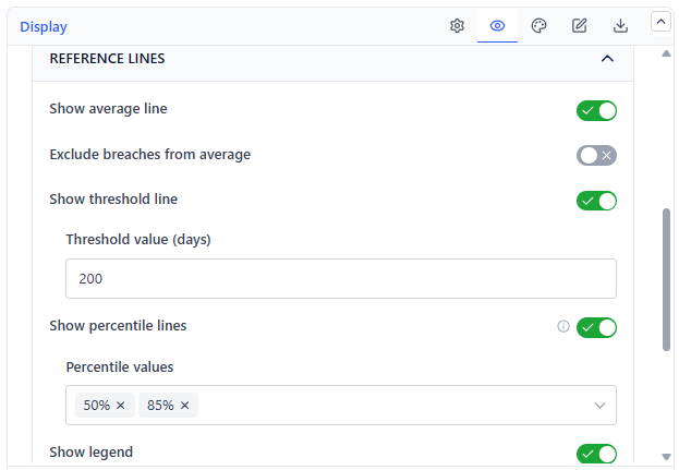 | 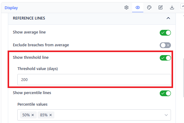 |
| Overlay | What It Draws | Default |
|---|---|---|
| Average line | A vertical line at the mean duration | On |
| Threshold line | A vertical line at your SLA or target value | Off |
| Percentile lines | Vertical lines at the percentiles you pick (5%–99%) | On (50th and 85th) |
| Exclude breaches from average | Recomputes the average ignoring items past the threshold | Off |
On a histogram these lines read as cut points: everything to the right of the 85th percentile line is your slow tail, and its width tells you how bad the tail is.
Display Options
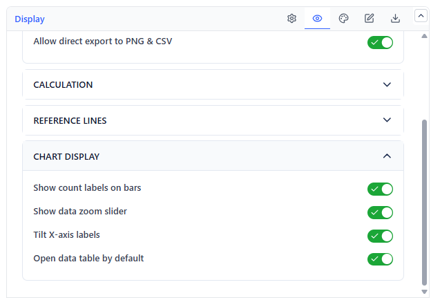 | 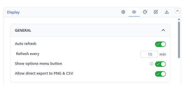 |
| Setting | What It Does | Default |
|---|---|---|
| Show legend | Legend for bars and reference lines | On |
| Show count labels on bars | Prints the item count above each bar | On |
| Show data zoom slider | Adds a scroll and zoom control to the X-axis | Off |
| Tilt X-axis labels | Angles bucket labels so long ranges stay readable | Off |
| Open data table by default | View mode opens on the table | Off |
| Show options menu button | The in-view refresh and export menu | On |
| Allow direct export to PNG & CSV | Whether viewers can export | On |
| Auto refresh | 5, 10, 15, or 30 minute interval | Off (15 min) |
Colors
| Element | Default |
|---|---|
| Bars | Blue |
| Average line | Orange |
| Threshold line | Red |
| Percentile lines | Purple |
Export
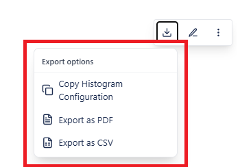
| Format | Contains |
|---|---|
| CSV | Every work item with its type, start and end status and time, and cycle duration |
| A tabular PDF of the same records |
Common Use Cases
Setting a defensible SLA. Read the 85th percentile off the chart and propose that as the SLA, rather than negotiating from a wish.
Proving an improvement. Chart the same window length before and after a process change. A distribution that shifted left and got narrower is the clearest evidence you can hand a stakeholder.
Finding hidden work types. A two-peaked distribution nearly always means two different work types share one board. Split them and manage them separately.