Series & Display
Series
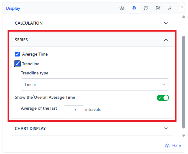
| Series | What It Draws | Default |
|---|---|---|
| Average Time | The bars themselves - average cycle time per interval | On |
| Trendline | A fitted line across the bars | On |
| Show the Overall Average Time | A figure in the top-right corner of the chart (for example "Avg time in last 3 intervals: 63.38 d") - the average across the last N intervals | On (3 intervals) |
Trendline Types
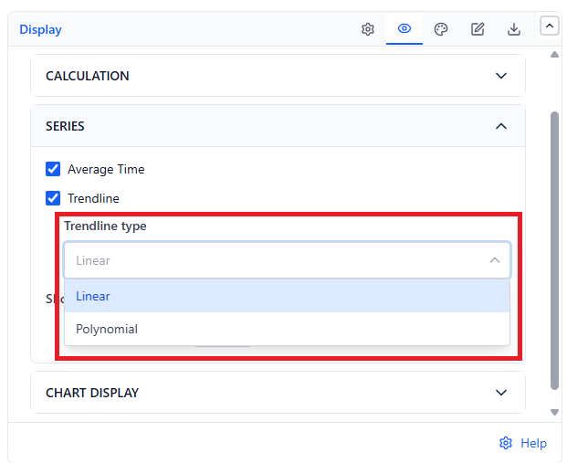
| Type | Shape | Use When |
|---|---|---|
| Linear (default) | A straight line | You want the plain direction - up, down, or flat. Easiest to defend in a review |
| Polynomial | A curve | The trend genuinely reversed mid-period and a straight line would hide it |
A polynomial fit will follow noise if you give it few bars. With under about eight intervals, stay linear.
Overall Average Window
The overall average figure is computed over the most recent N intervals, not the whole chart. Set N to your planning horizon: 3 intervals for a rolling recent read, or the full interval count if you want a true chart-wide average.
Display Options
 |  |
| Setting | What It Does | Default |
|---|---|---|
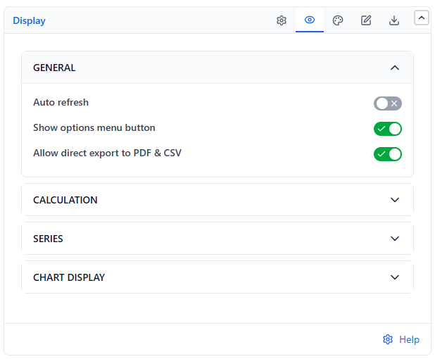
| Auto refresh (General) | Re-fetches data on a 5, 10, 15, or 30 minute interval | Off (15 min) |
| Calculate in (Calculation) | Unit for cycle time: Days, Hours, Minutes, or Weeks | Hours |
| Don't count weekends (Calculation) | Leaves Saturdays and Sundays out of every cycle time | Off |
| Show options menu button (General) | The in-view refresh and export menu | On |
| Allow direct export to PDF & CSV (General) | Whether viewers can export | On |
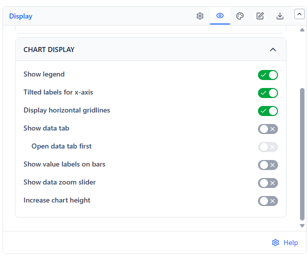
| Show legend | Legend for the Average Time bars and the trendline | On |
| Tilted labels for x-axis | Angles interval labels - useful with sprint names | On |
| Display horizontal gridlines | Horizontal gridlines behind the bars | On |
| Show data tab | Makes the table view available in view mode | Off |
| Open data tab first | View mode opens on the table. Shown when Show data tab is on | Off |
| Show value labels on bars | Prints each bar's value above it | Off |
| Show data zoom slider | Scroll and zoom control on the X-axis | Off |
| Increase chart height | Sets a fixed Chart height in pixels (320-600) instead of filling the gadget | Off |
Colors
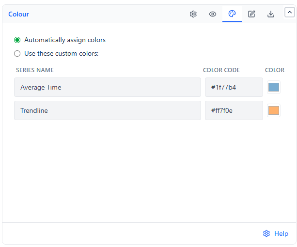
| Element | Default |
|---|---|
| Average bars | Blue |
| Trendline | Orange |
Export
PDF captures the chart, or the Data tab if it is open, as shown. CSV exports every work item behind the chart with its interval, cycle start, cycle end, and duration - so you can verify any bar or hand the raw data to someone else.
Common Use Cases
Quarterly delivery review. 12 weekly bars with a linear trendline gives a one-glance answer to "did we get faster this quarter?"
Proving the effect of a process change. Set the interval to your sprint cadence and count enough bars to cover several sprints either side of the change.
Retrospective input. Use Board Sprints intervals so each bar is a sprint the team remembers, then open the data table on the worst bar and discuss those specific items.