Overview
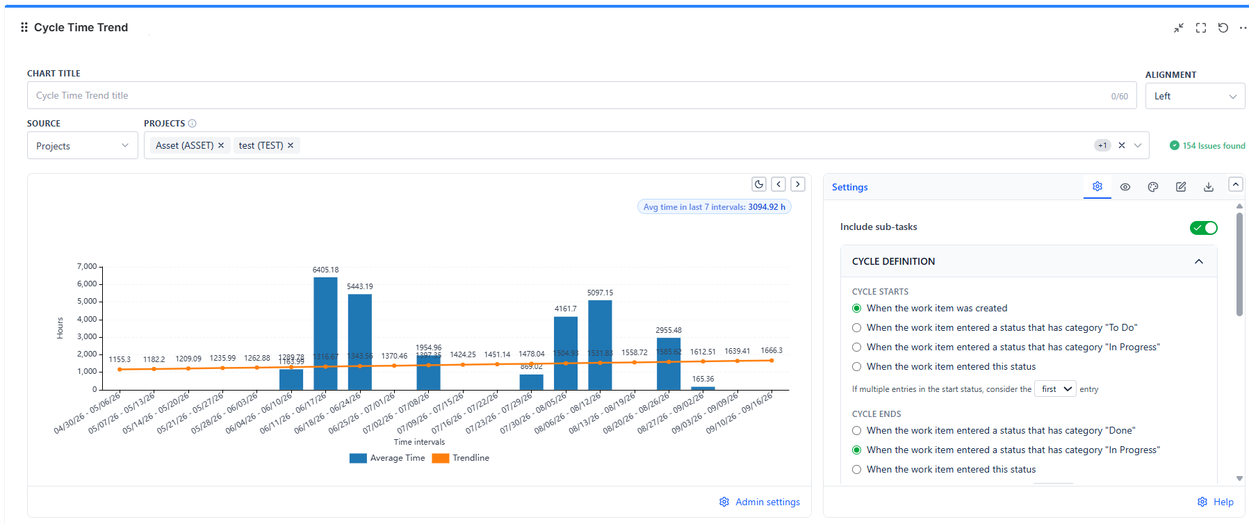
Each bar is one interval - a week, a month, or a sprint. Its height is the average cycle time of every item that completed inside that interval. Put six or twelve bars side by side and the trend is obvious in a way no single-snapshot chart can be.
Overview
| Feature | Description |
|---|---|
| One Bar per Interval | Average cycle time for items completed in that interval |
| Eight Interval Lengths | 1, 2, 3, 4, 6, or 8 weeks, 1 calendar month, or the board's own sprints |
| Trendline | Linear or polynomial fit over the bars |
| Overall Average | A figure in the top-right corner of the chart, averaged over the last N intervals - not a line on the chart |
| Cycle Definition | Choose when the cycle starts and ends, and how repeat entries and repeated cycles are handled |
| Data Table View | Every item behind every bar, with dates and durations |
How to Read the Chart
- Bars trending upward = delivery is slowing. Usual causes: item size growing, WIP growing, review queues growing
- Bars trending downward = delivery is speeding up; worth naming what changed so you keep doing it
- One tall bar among short ones = one interval absorbed a few long-running items. Check the data table before treating it as a trend
- Bars flat but tall = stable but slow. Predictable, which is useful; the improvement conversation is separate
- A missing or very short bar = few or no items completed in that interval
Action pattern: Use the trendline for the story and the bars for the evidence. A trendline alone can hide the fact that one interval carried the whole change.
Data Sources
Projects, Board, Saved Filter, Custom JQL, and Dynamic Filter Controller.
Selecting Board Sprints as the interval requires a Scrum board as the data source - Kanban boards have no sprints to draw intervals from.
Cycle Definition
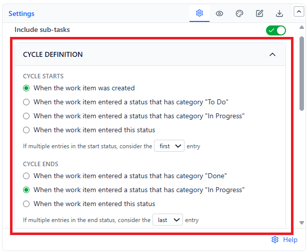
Works much like the Control Chart: choose when the Cycle starts and when the Cycle ends (for lead time, start it When the work item was created), and decide how repeat entries and repeated cycles are handled. The default calculation unit here is hours, which suits shorter support-style cycles; switch to days or weeks for delivery work.
Include sub-tasks on the Settings tab (off by default) counts sub-tasks as their own work items.