Display Modes
Each formula picks its own display mode. Pick by what the reader has to do with the number.
Modes
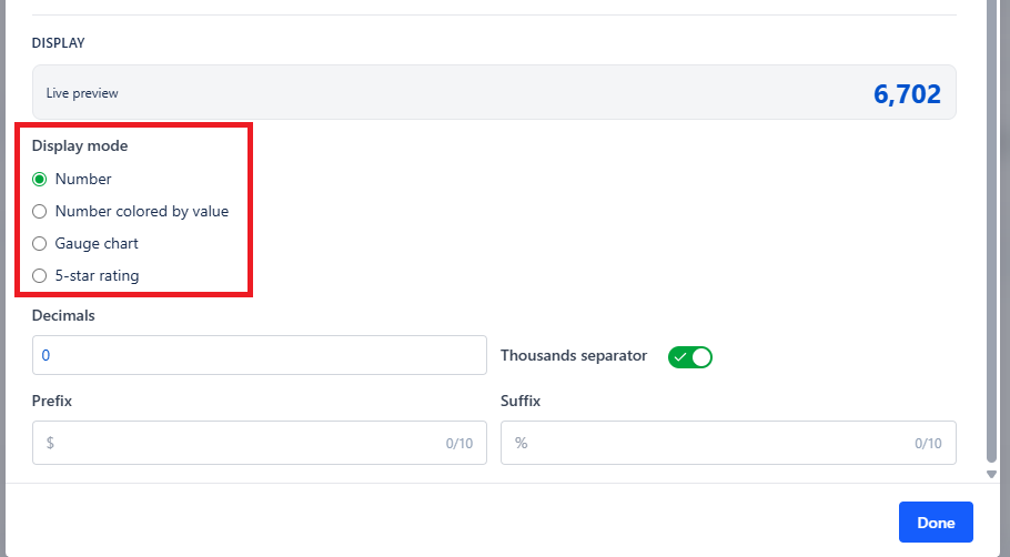
| Mode | Shows | Use When |
|---|---|---|
| Number | A plain number in the card | The value speaks for itself |
| Number colored by value | The number, colored by fixed color or value range, with an optional border highlight | Good or bad matters at a glance |
| Gauge chart | A radial gauge with min, max, and colored bands | The number is meaningful against a target range |
| 5-star rating | The value mapped onto a star scale | Satisfaction and quality scores, for non-technical audiences |
Color Rules
Colored numbers and gauges are driven by value ranges. Define each band with its bounds and color:
| Range | Color | Reads As |
|---|---|---|
| 0 to 5 | Green | Healthy |
| 5 to 15 | Amber | Watch |
| 15 and above | Red | Act |
Make sure your bands cover the whole plausible range with no gaps. A value that falls in a gap gets the default color, so it no longer signals a state.
For metrics where lower is better - defect rate, cycle time - invert the order so green sits at the bottom. Do not rely on the reader working that out.
Gauge Settings
| Setting | What It Does |
|---|---|
| Gauge min / Gauge max | The gauge's range. Set these to something meaningful, not just the current value |
| Gauge color bands | The colored bands drawn around the arc |
A percentage gauge should nearly always run 0 to 100, even if today's value is 12 - a gauge scaled to its own value tells the reader nothing about how much room is left.
Star Rating Settings
| Setting | What It Does |
|---|---|
| Number of stars | How many stars are drawn (1-10) |
| Value for full stars | The formula value that equals a full set of stars |
If your formula returns a percentage, set Value for full stars to 100. If it returns a 1-5 score, set it to 5.
Layout
The cards layout arranges every enabled formula as a card in one gadget - four or five KPIs in the space of one chart. Keep labels short; the card is the whole explanation the reader gets.
Export
| Format | Contains |
|---|---|
| PNG | The KPI panel as displayed |
| CSV | Each formula with its label and computed result |
Common Use Cases
Escaped defect rate. Production bugs divided by all bugs, as a gauge with green under 5%.
On-time delivery. Items completed by their due date divided by all completed items, as a percentage.
Bug-to-story ratio. Bug count divided by story count for the sprint - a rising number is a quality warning.
Sprint completion. Story points done divided by points committed, as a gauge running 0 to 100.
Support satisfaction. Average of a CSAT custom field, displayed as a star rating for a leadership dashboard.